There seems to be a theme of extreme eclecticism sweeping the design world, and I most definitely am not on board. At all. A few funky/strange things in a room add interest. A moderate amount seems artsy. But Exhibit A above is just plain ugly. I apologize if you love this room. You would probably hate my living room.
One of the main aspects of extreme eclecticism that I don't care for is that these types of rooms often seem sparse and uncomfortable. Point and case:

I'm imagining this invitation:
"Hi ______ (insert name here). Want to hang out tonight? You can sit in the wooden chair and stair at the corner, and I'll lounge on my pile of pillows leaning against the wall. Bring your new book too- we installed a great new ceiling light for you to read by!"
I love cohesive color, cozy and inviting rooms, well lit spaces, and above all, spaces that generally look like there has been some thought put into them. Like a chair with padding beats one without. Every time.
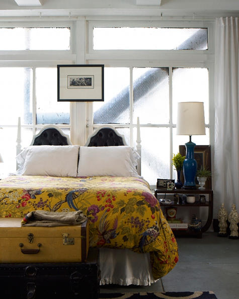
HOWEVER, there are exceptions. Take a looksee:

This space is beautiful! It's very eclectic but it works. There's comfortable place to sit, for one. And the color palate is fun and punchy. Compare this room with the first room (here it is again):

No comparison, right? The fun, punchy room looks like someone put some thought into it. The drab, random room looks just that.
And I'm done now.

No comments:
Post a Comment
Note: Only a member of this blog may post a comment.